Color has the power to shape how we feel, think, and interact within our homes. It can make a room feel cozy or spacious, formal or relaxed, energetic or serene. When chosen intentionally, paint colors enhance the flow of your home and elevate its design. But in a market like Pinecrest and Palmetto Bay, where tropical landscapes, natural light, and architectural diversity come into play, picking the right palette is both an art and a science.
At The Elena Kemper Group, we know that color choices impact not just aesthetics, but also how buyers perceive a home. Whether you're designing your forever home or preparing to sell, understanding how to choose paint tones for every room is essential to creating a cohesive, high-impact living space.
Here’s how you can use color strategically, based on design psychology, lighting, and lifestyle—plus tips tailored to the Pinecrest and Palmetto Bay market.
Why Color Psychology Matters
Color psychology is the study of how colors influence mood and perception. While personal taste always plays a role, the science of color can guide your selections based on the room’s purpose.
Blues and Greens are calming and restful, perfect for bedrooms, bathrooms, and reading nooks.
Neutrals like beige, taupe, ivory, and greys serve as versatile backdrops that allow other design elements to stand out. They’re also highly favored by buyers and create a sense of balance.
Yellows and Warm Earth Tones evoke cheerfulness and warmth, great for kitchens, breakfast areas, and entryways.
Darker Tones like navy, charcoal, or forest green can bring elegance and drama to a formal dining room, powder bath, or office—when used sparingly or balanced with light.
Whites reflect light and convey cleanliness and simplicity. In modern South Florida homes, white walls are often paired with warm woods, stone, or bold accents.
Understanding the emotional impact of color can help you use it intentionally, aligning your design with how you want to feel in each space.
Start with Light: Natural vs. Artificial
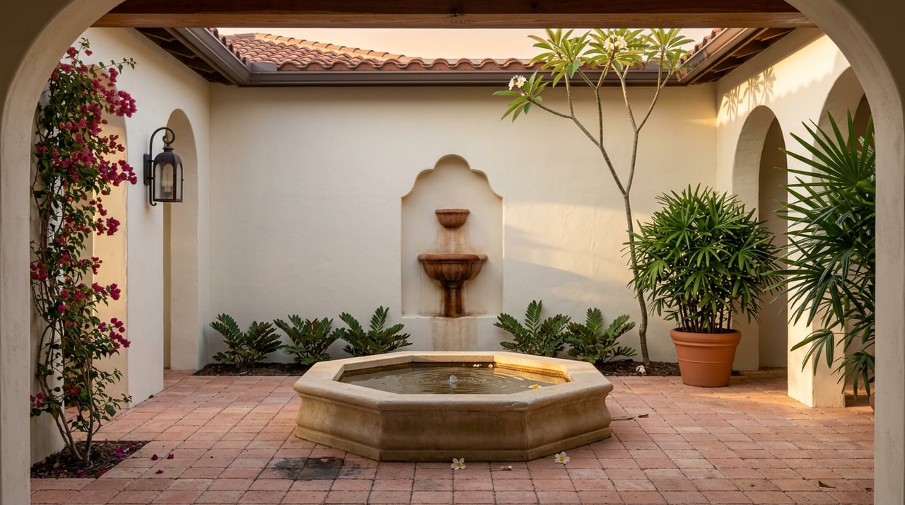
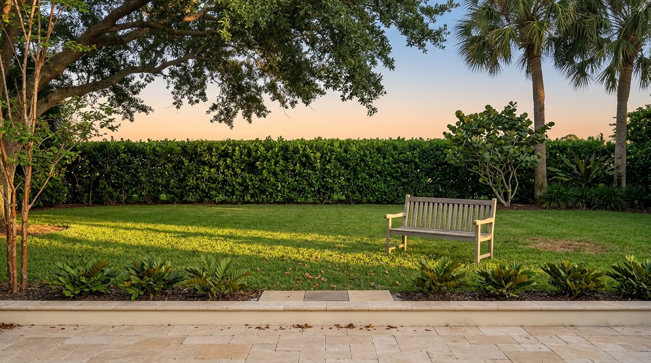
In Pinecrest and Palmetto Bay, we’re fortunate to have abundant sunshine year-round. Natural light plays a critical role in how colors are perceived. A pale gray might look crisp in a bright room but flat or muddy in a space with less light. South-facing rooms receive the most consistent daylight, while north-facing spaces might need warmer tones to feel inviting.
Before committing to a color, test it on multiple walls and observe it at different times of day. Morning light, evening shadows, and artificial lighting all shift the tone. Consider using warmer whites in shaded rooms and cooler tones in sun-drenched areas to balance light.
For rooms with large windows and lush outdoor views, choose colors that complement the landscape. Soft greens, sandy beiges, and water-inspired blues connect the indoors with South Florida’s natural beauty.
Room-by-Room Color Strategy
- Living Room: The living room is typically the heart of the home, where comfort meets style. Light, neutral shades like warm greys, creamy whites, or greige offer a polished foundation. If you love color, consider a muted sage or coastal blue for subtle personality. In homes with open floor plans, use a consistent base color throughout the main areas to maintain visual flow.
- Kitchen: Kitchens should feel fresh, clean, and energizing. White remains a timeless choice, especially with contrasting islands or backsplashes. If your cabinets are white or wood-toned, consider pale gray, soft green, or even a buttery yellow for the walls. These colors reflect light beautifully and feel warm without overwhelming the space.
- Dining Room: For a more formal or intimate dining experience, deeper colors work well. Charcoal, navy, or a moody green can add richness, especially when paired with white wainscoting or trim. If your dining room opens to another area, stick with complementary tones to avoid visual discord.
- Bedroom: Bedrooms should be restful retreats. Choose colors with cool undertones, like soft blues, dusty rose, lavender, or gentle greys. Earthy tones like sand or clay can also work in a primary bedroom. In children’s rooms, you can explore more playful pastels or muted primary colors.
- Bathroom: Smaller rooms are perfect for experimenting. Bathrooms benefit from crisp whites, pale blues, or even dramatic hues like navy or black—especially when paired with gold or chrome fixtures. Just ensure there’s enough lighting to balance darker colors.
- Home Office: With many homeowners working remotely, the home office has become a key space. Muted greens and blues support focus, while greys and neutrals offer versatility. Want a creative edge? Consider an accent wall in a saturated tone like terracotta or ink blue.
- Hallways and Entryways: These transitional spaces are often overlooked, but they set the tone for the entire home. Light neutral colors keep things bright and welcoming. If you have art or family photos on the wall, go with a soft white or greige to avoid competing with the display.
Color Trends in Pinecrest and Palmetto Bay
Homeowners in Pinecrest and Palmetto Bay often favor elegant neutrals with a coastal or contemporary twist.
Popular choices include:
- Warm whites like Alabaster or Swiss Coffee
- Greiges such as Revere Pewter or Edgecomb Gray
- Soft blues and greens that mirror the water and palms
- Accents of navy, black, or brass for a modern edge
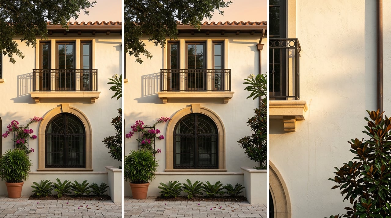
Exterior color palettes often lean toward stucco whites, light earth tones, and slate-colored roofs. These pair well with natural materials like stone, wood, and black window frames, which are increasingly popular in new construction and renovations.
If you’re painting before selling, a neutral interior appeals to a wider range of buyers and helps them imagine their own furniture and decor in the space.
If you’re painting before selling, a neutral interior appeals to a wider range of buyers and helps them imagine their own furniture and decor in the space.
Practical Tips for Choosing Paint
- Always test paint in your own space. Buy sample pots and paint large swatches on the wall.
- Consider your flooring, cabinetry, and fixed elements before choosing a wall color.
- Use low or no-VOC paints for better indoor air quality.
- Paint finishes matter. Use flat or matte for ceilings, eggshell for walls, and semi-gloss or satin for trim, kitchens, and baths.
- Don’t forget the ceiling. Painting it a slightly lighter version of your wall color can make a room feel taller and more cohesive.
The Power of Color in Home Value
Color can influence how fast a home sells and how much buyers are willing to pay. Well-chosen tones make rooms feel updated, clean, and cohesive. Harsh or outdated colors can have the opposite effect. If you’re preparing to list your Pinecrest or Palmetto Bay home, consult a staging or design expert to ensure your palette resonates with today’s buyers.
At The Elena Kemper Group, we’ve helped countless sellers refresh their homes with smart, strategic paint choices that increased visual appeal and market value. We also guide buyers who want to visualize a home’s potential through a simple coat of paint.
Ready to Refresh or Sell Your Home?
The right colors can transform a space—and boost your property’s appeal. Whether you’re preparing your home for market or designing the perfect environment for your family, The Elena Kemper Group can connect you with trusted designers, painters, and color consultants in Pinecrest and Palmetto Bay.
Contact us today for expert real estate advice and local insights that go far beyond the transaction. Your dream home starts with the perfect palette. Let us help you find it.